

Understanding Color Contrast
The way colors interact can dramatically influence how we perceive images, designs, and even everyday objects. Understanding color contrast is essential for photographers, designers, and anyone interested in visual communication. Whether you're capturing a cityscape at night or designing a website, mastering the principles of color contrast helps ensure your work is both visually appealing and accessible.
This guide explores the fundamentals of color contrast, its impact on visibility and mood, and practical tips for applying these concepts in creative projects. For those interested in related techniques, you may also find value in learning about using light for visual rhythm, which complements the concepts discussed here.
What Is Color Contrast?
At its core, color contrast refers to the difference between two or more colors placed side by side. This difference can be based on hue, lightness, saturation, or a combination of these factors. High contrast makes elements stand out, while low contrast can create a more subtle, harmonious effect.
In photography and design, effective use of color contrast can guide the viewer’s attention, create a sense of depth, and improve readability. For example, pairing a bright color with a dark background ensures text or objects are easy to see. On the other hand, similar colors with little contrast may blend together, making it harder to distinguish details.
Types of Color Contrast
There are several ways to create contrast between colors. Here are the most common types:
- Hue Contrast: This involves using colors from different parts of the color wheel, such as blue and orange or red and green. The greater the distance between hues, the stronger the contrast.
- Light-Dark Contrast: Also known as value contrast, this is the difference in brightness between colors. White on black is a classic example of high light-dark contrast.
- Saturation Contrast: Highly saturated colors placed next to muted or grayish tones create a vibrant effect.
- Warm-Cool Contrast: Warm colors (reds, oranges, yellows) contrasted with cool colors (blues, greens, purples) can evoke different moods and direct attention.
Why Color Contrast Matters in Visual Communication
The strategic use of contrast is vital for both aesthetic and functional reasons. Here’s why it matters:
- Accessibility: Sufficient contrast ensures that text and important elements are readable for everyone, including people with visual impairments.
- Focus: High contrast draws the viewer’s eye to key areas, making your message clearer.
- Emotion: Contrast can set the mood of an image or design, from energetic and bold to calm and understated.
- Branding: Consistent use of contrast helps reinforce brand identity and recognition.
Applying Contrast in Photography
Photographers rely on contrast to create dynamic images. By understanding how different colors interact, you can make subjects pop or blend seamlessly into their surroundings. For example, shooting a red car against a green landscape leverages hue contrast for maximum impact.
Light and shadow also play a crucial role. Scenes with strong highlights and deep shadows naturally create value contrast, adding drama and depth. For more on this, explore light intensity photography for practical techniques.

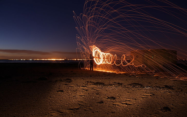
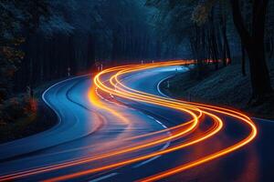
Contrast and Motion: Capturing Dynamic Scenes
When photographing moving subjects, such as cars at night, color contrast becomes even more important. The interplay of light trails against a dark background can create a sense of speed and excitement. Using complementary colors—like blue and orange—can further enhance the visual impact.
If you're interested in learning more about these techniques, check out our resource on how to photograph car motion for tips on capturing movement with clarity and style.
Best Practices for Effective Color Contrast
To make the most of color contrast in your work, consider these practical guidelines:
- Test Readability: Always check that text stands out against its background. Use online tools to measure contrast ratios, especially for web and app design.
- Limit Color Combinations: Too many contrasting colors can overwhelm the viewer. Stick to a focused palette for clarity.
- Consider Context: Think about where your image or design will appear. Lighting conditions and screen types can affect how contrast is perceived.
- Use Contrast for Emphasis: Direct attention to important elements by increasing their contrast relative to the rest of the composition.
- Balance with Harmony: While contrast is powerful, balancing it with harmonious color relationships creates a pleasing overall effect.
Contrast in Digital Design and Accessibility
For digital designers, ensuring adequate contrast is not just a matter of style—it’s a requirement for accessibility. Guidelines such as the Web Content Accessibility Guidelines (WCAG) specify minimum contrast ratios for text and images. Meeting these standards helps make content usable for people with low vision or color blindness.
Many modern design tools include built-in contrast checkers. By prioritizing accessibility, you not only reach a wider audience but also improve the overall user experience.
Creative Inspiration: Exploring Light and Color
Experimenting with contrast can open up new creative possibilities. Try capturing scenes at different times of day, or use artificial lighting to highlight specific colors. For more ideas, see our article on creative use of blur and sharpness, which explores how focus and contrast work together to shape an image.
Lighting is a key factor in how colors appear and interact. To deepen your understanding, you might find this in-depth guide on the importance of light in photography helpful for both beginners and experienced creators.
Frequently Asked Questions
How do I check if my color contrast is sufficient for accessibility?
Use online contrast checker tools to compare your foreground and background colors. Aim for a contrast ratio of at least 4.5:1 for body text and 3:1 for large text, as recommended by WCAG standards.
What are some common mistakes when using color contrast?
Common pitfalls include using colors with insufficient contrast, relying solely on color to convey information (which can be problematic for color-blind users), and overusing contrasting colors, which can create visual clutter.
Can color contrast affect the mood of a photograph?
Absolutely. High contrast often creates a bold, energetic feel, while low contrast can evoke calmness or subtlety. The choice of contrasting colors also influences the emotional tone of an image.
Where can I learn more about using light and color creatively?
Explore our articles on using long exposure for water and light intensity photography for more inspiration and practical advice.
This article contains affiliate links. We may earn a commission at no extra cost to you.
This article contains affiliate links. We may earn a commission at no extra cost to you.
This article contains affiliate links. We may earn a commission at no extra cost to you.
This article contains affiliate links. We may earn a commission at no extra cost to you.
This article contains affiliate links. We may earn a commission at no extra cost to you.