

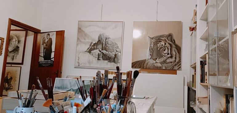
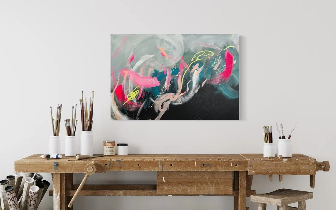
Using typography in photo wall displays to captivate and inspire
In the realm of professional photography, the art of displaying work is as crucial as the art of capturing moments. A growing trend among photographers is using typography in photo wall displays to enhance the visual appeal and narrative strength of the photographic collection. This innovative approach not only adds an extra layer of meaning to the images but also engages viewers in a more profound way. In this article, we will explore how you can effectively integrate typography into your photo wall displays to create a captivating and inspiring experience for your audience.
Understanding the Power of Typography
Typography is more than just selecting a font. It is about choosing the right typeface, size, color, and placement to convey the intended message. In photo wall displays, typography can serve as a powerful tool to guide viewers' eyes, evoke specific emotions, or provide context to the images. When used thoughtfully, it can transform a simple photo display into a compelling narrative.
For instance, consider a series of black and white portraits. Adding understated, elegant typography in a serif font can emphasize the timelessness and elegance of the images. On the other hand, bold and colorful typography can inject energy and vibrancy, making the photos come alive. For more ideas on transforming your photo displays, check out photo-based painting techniques.
Choosing the Right Typography
When it comes to using typography in photo wall displays, the first step is to choose the right typeface that complements your images. Here are a few tips:
Match the Mood
Consider the mood and theme of your photos. If your photos have a vintage or classic feel, opt for serif fonts that echo the elegance of bygone eras. For modern or minimalist photos, sans-serif fonts are a great choice as they offer a clean and contemporary look.
Consider Readability
While artistic expression is important, readability should not be compromised. Ensure that the typography is legible from a distance, especially if the display is in a public or large space. The size and spacing of the text can significantly affect its readability, so adjust these elements accordingly.
Color Coordination
The color of your typography should harmonize with the color palette of your photographs. If your images are colorful, a neutral-colored text can prevent visual overload. Conversely, if your photos are monochromatic, a splash of color in the typography can add interest and contrast.
Placement and Integration
Once you have chosen your typography, the next step is to integrate it seamlessly with your photo wall display. The placement of text can drastically alter the visual dynamics of your display.
Strategic Placement
Place typography in a way that complements the flow of your images. Text can be positioned to lead the viewer's eye across the display, creating a cohesive and engaging experience. For example, placing text at the beginning and end of a photo sequence can frame the narrative, while text interspersed between images can add depth and context.
Layering and Overlapping
Experiment with layering and overlapping text with images to create a unique visual effect. Transparent or semi-transparent typography allows the photographs to remain the focal point while adding an artistic flair. This technique can be particularly effective in displays where space is limited.
For more innovative ideas on photo wall decor, explore our guide on unique photo wall decor ideas.
Interactive and Dynamic Displays
Incorporating interactive elements into your typography and photo wall display can enhance viewer engagement. Consider the use of QR codes linked to digital content, such as behind-the-scenes videos or detailed photo descriptions. This approach not only provides additional context but also connects the physical display to a digital experience.
Dynamic displays using digital screens can also offer rotating text and images, allowing for a constantly changing visual narrative. This method is particularly useful in galleries and exhibitions where attracting and retaining viewer attention is paramount.
For more ideas on how to dynamically present your art, you might want to explore digital photo-based paintings.
Conclusion
Using typography in photo wall displays opens up a world of creative possibilities for professional photographers. It offers a unique way to enhance the storytelling aspect of your photographs, engage your audience, and set your work apart. By thoughtfully selecting and integrating typography, you can create photo displays that are not only visually stunning but also rich in narrative depth. Whether you're showcasing your work in a gallery, a studio, or a personal space, the right typography can transform your photo wall display into a truly immersive experience.
For further reading on how your decor choices can impact mood and perception, consider visiting this insightful article.
FAQ
How can typography enhance a photo wall display?
Typography can enhance a photo wall display by adding context, guiding the viewer's eye, and evoking emotions that complement the visual story told by the photos.
What type of fonts work best for photo wall displays?
The best fonts for photo wall displays depend on the theme and mood of your photos. Serif fonts are ideal for classic themes, while sans-serif fonts suit modern, minimalist styles.
How can I ensure that my typography is readable in a display?
To ensure readability, choose a font size that is legible from a distance, maintain adequate spacing, and select a color that contrasts well with your photo's background.