

Exploring Popular Colors in Large Art: A Photographer's Guide
When it comes to large art, the selection of colors can dramatically influence how a piece is perceived and appreciated. For professional photographers, grasping the significance of popular colors in large art is essential for crafting visual masterpieces that appeal to audiences. The right colors can elicit emotions, establish moods, and even transform environments. But which colors are trending today, and how can photographers seamlessly integrate these shades into their work?
Why Colors Are Important in Large Art
Colors hold the ability to express messages and feelings without uttering a single word. In large art, color selection shapes the artwork's overall atmosphere. For example, warm tones like reds and oranges can emanate warmth and energy, while cool shades such as blues and greens can instill a sense of calmness and relaxation. As a photographer, recognizing these subtleties can aid you in framing your shots more effectively and choosing the perfect color schemes for your subjects.
Todays Trends in Popular Colors
The art world is constantly evolving, with color trends mirroring broader cultural and societal changes. Currently, among the most popular colors in large art are muted earth tones, vivid jewel tones, and soft pastel shades. These hues are frequently employed to foster an ambiance of tranquility, luxury, or nostalgia. By keeping abreast of these trends, photographers can gain a competitive edge in the dynamic art market.
Muted Earth Tones
Muted earth tones like terracotta, beige, and olive green have surged in popularity recently. These colors often evoke a sense of nature and sustainability, making them ideal for artists and photographers aiming to create eco-friendly and organic artworks. Incorporating these tones into your photography can instill a sense of balance and harmony.
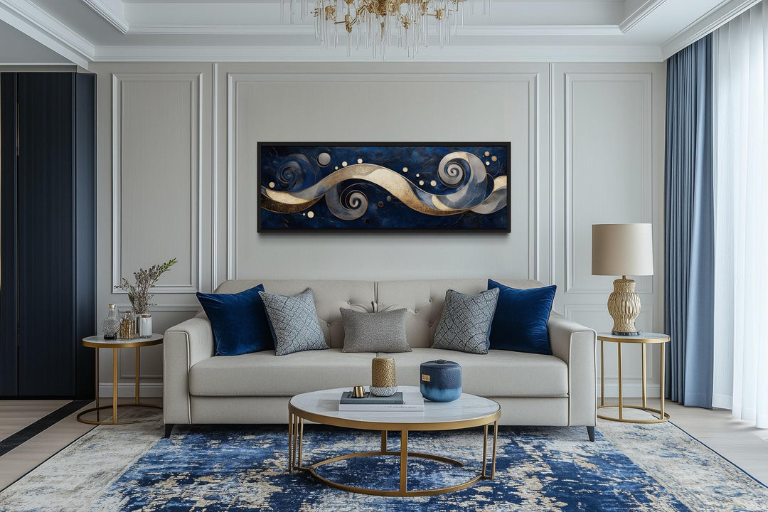
Vibrant Jewel Tones
Conversely, vibrant jewel tones such as emerald green, sapphire blue, and ruby red are making a strong resurgence. These colors project luxury and sophistication, making them perfect for upscale art pieces. For photographers, opting for jewel tones can result in bold and captivating images.
Pastel Shades
Soft pastel shades like blush pink, baby blue, and lavender are also trending in the art scene. Typically associated with gentleness and delicacy, these colors can be wonderful for creating romantic and ethereal artworks. As a photographer, using pastels can help create subtle contrasts and draw attention to intricate details within your subjects.
Integrating Popular Colors into Photography
For professional photographers, weaving popular colors in large art into your work can elevate the aesthetic and attract potential clients. One effective method is experimenting with diverse lighting techniques to enhance the depth of colors in your photographs. Additionally, consider incorporating props or backgrounds that harmonize with the color palette of your subjects, or check out our tips on hand-painted canvases.
Another strategy is to study the works of renowned artists and photographers who have mastered the use of these colors. By analyzing their methods and styles, you can extract valuable insights and inspiration for your own photography. For further ideas, consider reading about nostalgic expressions.
Selecting the Right Colors for Your Artwork
When it comes to selecting colors for your art, its vital to think about the message or emotion youre aiming to convey. Reflect on the mood you wish to evoke and the narrative you wish to tell through your art. By addressing these questions, you can select colors that resonate with your artistic vision and amplify the impact of your work.
Moreover, consider the venue where your art will be showcased. For instance, if your artwork will be displayed in a sleek, minimalist space, opting for neutral tones or monochromatic color schemes might be best. In contrast, if your art is set to be featured in an energetic and eclectic environment, bold and contrasting colors can make your work pop.
Frequently Asked Questions (FAQ)
What are the trending colors in large art right now?
Presently, some of the most coveted colors include muted earth tones, vibrant jewel tones, and pastel shades, which are commonly utilized to evoke various moods and atmospheres in large art.
How can photographers incorporate popular colors into their photography?
Photographers can weave popular colors into their work by utilizing distinct lighting techniques, props, and settings that complement their subjects' color palettes. Moreover, immersing themselves in the works of renowned artists can spark inspiration.
Why are colors essential in large art?
Colors play a pivotal role in large art as they can dramatically convey emotions, unsettle moods, and redefine spaces. The right color choices can significantly enhance the visual allure and influence of an art piece.
In conclusion, comprehending and employing popular colors in large art can markedly enrich the quality and attractiveness of your photography. By staying informed on prevailing color trends and experimenting with various techniques, you can create stunning pieces that resonate deeply with your audience. For further insights, explore the Big Wall Decor blog for additional inspiration.
Also, check our article on best wall decor for more ideas.