

Choosing Color Palettes for Large Art: A Guide for Photographers
As a professional photographer, the art you create or display is a critical component of your brand and visual storytelling. When it comes to choosing color palettes for large art, the decision is not merely about aesthetic preferences. It involves a strategic approach to ensure that the artwork complements its environment, captures attention, and effectively conveys the intended message.
The choice of color can transform a space, evoke emotions, and create a dynamic interaction between the art and its viewers. Whether you're designing a piece for a gallery, a client's home, or a commercial space, understanding how to select the right colors is essential.
Understanding Color Theory in Photography
Color theory is fundamental in photography and art. It involves the study of how colors interact, the visual effects of color combinations, and the psychological impact of colors. For photographers, mastering color theory can elevate your work from good to exceptional.
A basic principle of color theory is the color wheel, which helps in understanding primary, secondary, and complementary colors. This understanding is crucial when you're combining abstract and photo wall designs or any other photographic art.
Complementary Colors and Contrast
Complementary colors, situated opposite each other on the color wheel, create a vibrant look when paired together. Using complementary colors in large art can make the artwork pop, drawing the viewer's attention immediately. However, it's important to balance such contrasts to avoid overwhelming the viewer.
Choosing a Palette Based on the Environment
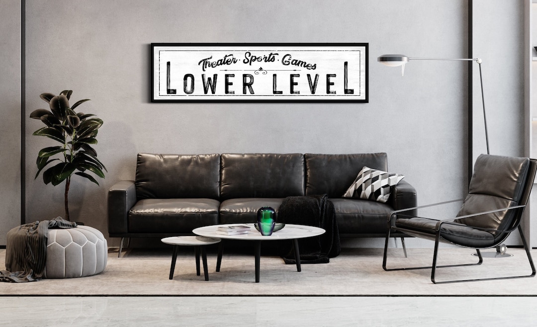
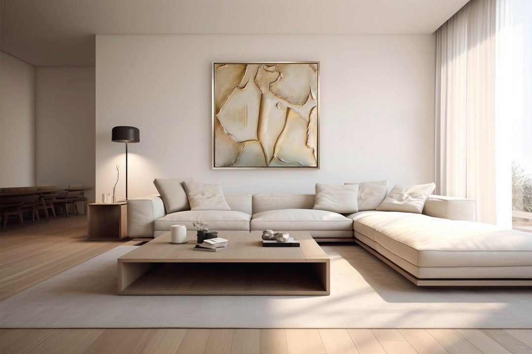
When selecting a color palette for large art, consider the environment where the art will be displayed. The colors should harmonize with the space's existing decor and lighting conditions. For instance, a serene blue palette might be ideal for a bedroom, while bold reds and oranges could energize a living room or commercial area.
It's also essential to consider the wall's color and texture. A well-sized piece of art with a carefully chosen palette can transform a plain wall into a focal point.
Integrating Mood and Emotion
Color palettes in photography should not only reflect the physical environment but also the emotional atmosphere you wish to create. Warm colors like reds, yellows, and oranges can evoke passion, warmth, and energy. In contrast, cool colors such as blues and greens often convey tranquility, peace, and calmness.
When designing or choosing art, think about the mood you want to set. For a commercial space, you might want to opt for colors that encourage activity and engagement, while in a home setting, comfort and calm might be preferable.
Practical Tips for Selecting Color Palettes
Here are some practical steps to guide you in choosing color palettes for large art:
- Start with a Base Color: Choose a dominant color as the base, and then select complementary or analogous colors to complete the palette.
- Use Color Tools: Leverage online tools and apps that can help you visualize color combinations and see how they interact.
- Consider the Lighting: Evaluate how natural and artificial lighting in the space will affect the appearance of the colors.
- Test Samples: Whenever possible, test color samples in the space to see how they look at different times of the day.
Famous Photographers and Their Use of Color
Looking at the work of famous photographers can be inspiring when selecting a color palette. For example, the vibrant and saturated colors used by Steve McCurry in his portraits or the muted, pastel tones in William Eggleston's work can provide insight into how color choices impact the viewer's experience.
Conclusion
The process of choosing color palettes for large art is a crucial aspect of art and photography that can impact both the aesthetic and emotional response to a piece. By considering color theory, the environment, and the emotions you wish to convey, you can create powerful, resonant art that speaks to your audience.
For further inspiration and ideas on large art, you might want to explore Big Wall Decor and see how colors play a crucial role in large installations.
FAQ
What role does lighting play in choosing a color palette?
Lighting can significantly alter how colors appear. Natural light tends to bring out true colors, while artificial lighting can cast hues that change the perception of those colors. It's important to consider lighting when selecting a palette to ensure the artwork looks its best at all times.
Can color palettes affect the mood of a space?
Absolutely. Colors have psychological effects and can influence the mood and atmosphere of a space. Warm colors tend to energize, while cool colors can calm and soothe.
How do I choose a color palette that complements existing decor?
Start by analyzing the prominent colors in the existing decor, including furniture, walls, and accents. Choose a palette that incorporates complementary or analogous colors to maintain harmony and balance within the space.