

Balancing Colors in Photo Wall Layouts: An Artful Guide
Designing a photo wall layout that draws in and captivates viewers is truly an artistic skill that hinges on a deep understanding of color balance. For professional photographers, mastering the subtleties of color balance in photo wall layouts can elevate their work, transforming a mundane wall into a vibrant gallery that tells a story. Thoughtful color placement not only heightens the visual appeal of the photos but also directs the viewer's gaze, crafting a cohesive and enjoyable visual journey.

The Significance of Color Balance in Photography
Color balance plays a crucial role in photography, especially when curating a series of images for a photo wall. Colors have the power to evoke feelings, establish mood, and even impact the perceived quality of photographs. As you plan your photo wall layout, it's vital to reflect on how colors interact with one another. Achieving the right balance ensures that no single image dominates, allowing each photograph to contribute to a visually harmonious display.
Grasping Color Theory
Color theory serves as the backbone of creating a well-balanced photo wall. By familiarizing yourself with the color wheel and the connections between complementary, analogous, and triadic colors, photographers can design layouts that are visually striking. Complementary colors, positioned opposite each other on the wheel, provide high contrast and grab attention, while analogous colors, situated next to each other, create a more subtle yet harmonious aesthetic.
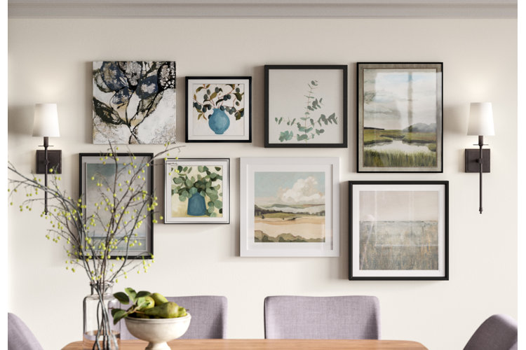
Strategic Color Placement in Photo Walls
When organizing a photo wall, thoughtful color placement is paramount. Start by identifying a dominant color that will act as the centerpiece of your layout. This could be a vibrant hue that catches the eye or a muted tone that allows your images to shine. Next, add secondary colors that enhance the dominant shade, ensuring a smooth visual flow across the display. You can explore nature-inspired ideas to inspire your designs.
Establishing Visual Hierarchy
Creating visual hierarchy in a photo wall layout helps guide the viewer's attention and highlights the most important elements. Utilize color contrast to draw attention to key images or themes. For example, juxtaposing a striking photo against more subdued ones can establish a focal point that naturally attracts attention. Additionally, consider the dimensions and shapes of each frame, as these factors also influence the overall balance and composition.
Practical Tips for Professional Photographers
Here are some actionable tips for photographers looking to refine their skills in balancing colors in photo wall layouts:
- Plan Your Palette: Begin with a mood board or digital mockup to visualize your color scheme and layout before finalizing your design.
- Assess Lighting Conditions: Colors can vary under different lighting. Ensure your wall is well-lit to preserve the integrity of your color choices.
- Mix and Match: Dont hesitate to blend different styles and color schemes. A mix of textures and tones can create depth and intrigue.
For further insights, check out exhibition tips to enhance your photo wall design.
Diving into the Psychology of Colors
Being aware of the psychology behind colors can significantly affect the impact of your photo wall. Each color can trigger distinct emotions and responses. For instance, blue is often linked with tranquility and calm, while red can incite passion and excitement. By taking into account the emotional resonance of colors, photographers can create layouts that connect with viewers on a deeper level.
Case Study: Effective Photo Wall Layouts
Many accomplished photographers have perfected the balance of colors in their photo wall arrangements. Analyzing their work can provide valuable insights into effective techniques and strategies. For example, a gallery showcasing both monochrome and color images can create a striking visual contrast that captivates its audience.
Learn more about the impact of decor choices on emotions by visiting Bob Vila's Article.
Wrapping Up: Mastering Color Balance
Balancing colors in photo wall layouts is an intricate skill that marries artistic vision with technical expertise. By grasping the principles of color theory, thoughtful placement, and the psychological effects of colors, professional photographers can craft engaging photo walls that not only beautifully display their art but also resonate deeply with viewers. With ongoing practice and experimentation, this proficiency can become an invaluable part of your photographic arsenal.
FAQs
What colors work best for a photo wall layout?
The best color choices depend on the mood you aim to achieve. Neutral tones provide flexibility, while vibrant colors can establish striking focal points.
How can I ensure balance in my photo wall?
Utilize a variety of frame sizes, shapes, and color contrasts to achieve a balanced appearance. Planning and testing with mockups are effective strategies.
What impact does lighting have on color balance?
Lighting significantly influences the way colors are perceived. Ensure your display area is well-lit to maintain the vividness and accuracy of your images.